← BACK TO WORK PROJECT I // CASE STUDY

Eagle Towing Equipment

Client Eagle Towing Equipment
Location Cambridge, ON, Canada
Industry Industrial Manufacture
Core Deliverables Identity, Strategy, Video, Training
[00 / OVERVIEW]

Uncovering the People-Centric Culture

Eagle Towing Equipment is a tow truck manufacturer based in Ontario. As a prominent family-owned business handing operations over to the second generation, they approached Sidian seeking a modern brand update that preserved their strong reputation.

Rather than a simple visual refresh, our research focused on identifying their deep emotional differentiator: an intense, people-centric culture that forms exceptionally loyal relationships with customers, partners, and employees alike.
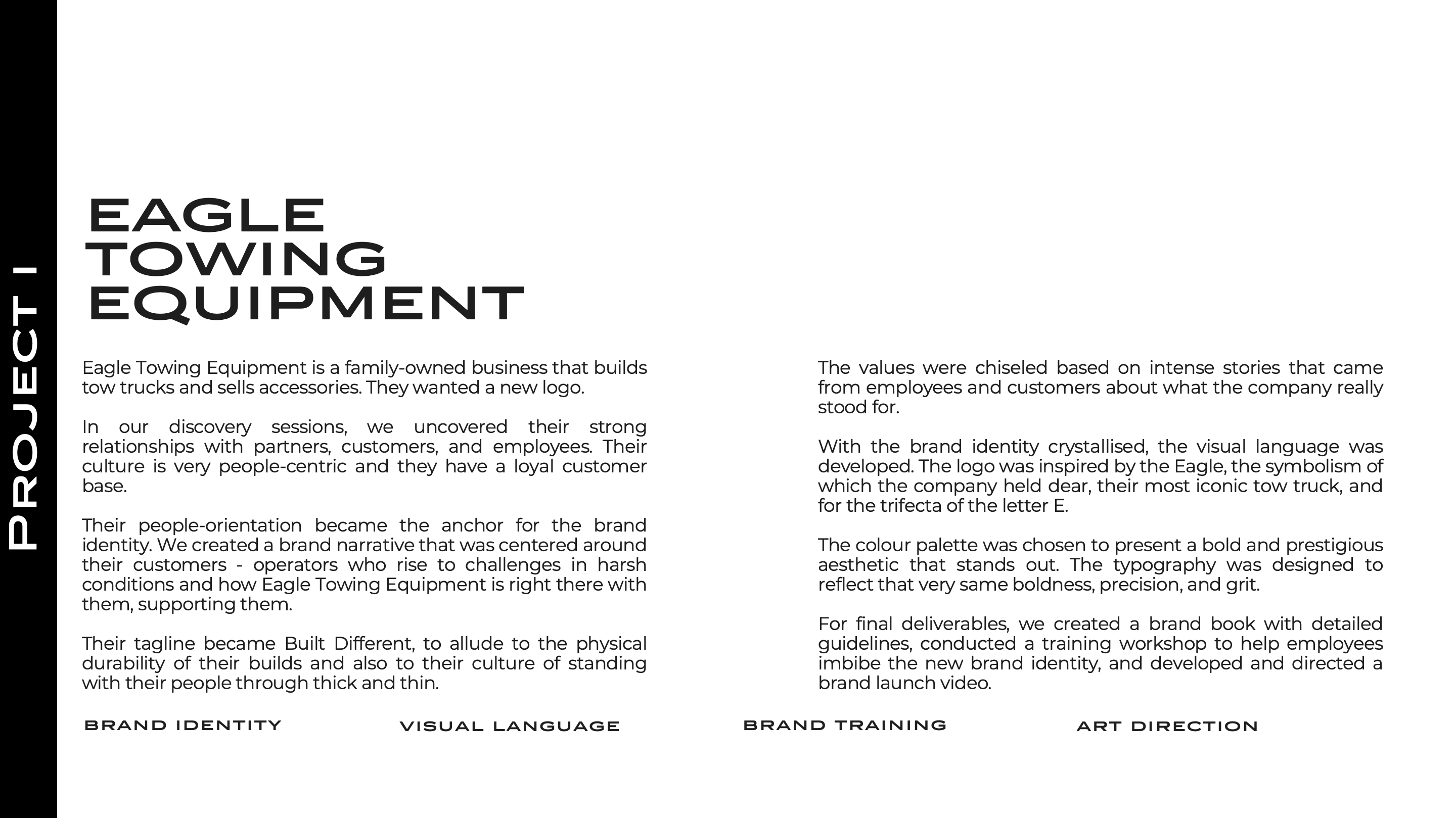
Eagle Towing Project Overview Slide
[01 / DISCOVERY PHASE]

Research, Interviews, & Workshops

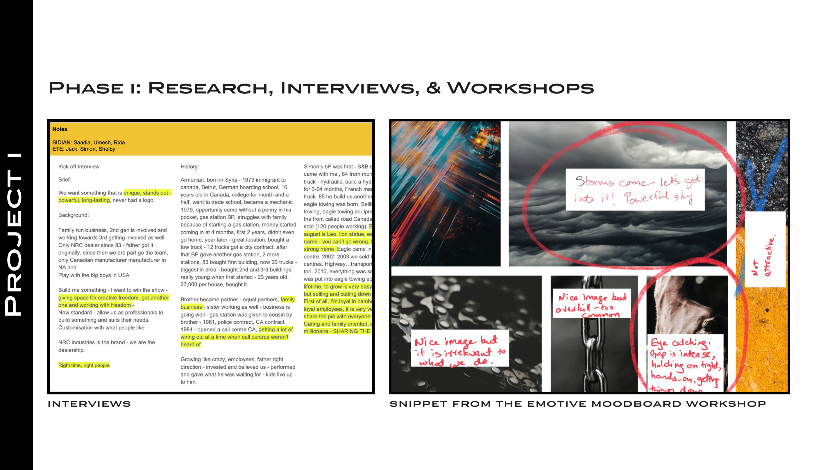
We initiated the design thinking process with exhaustive, hands-on discovery. This included on-site visits to the manufacturing facilities, direct interviews with employees and legacy operators, and a dedicated emotive moodboard workshop.

These raw, human-centric sessions yielded powerful stories that revealed the true essence of Eagle Towing: they stand with their clients through thick and thin, rising to meet extreme challenges.

Discovery and Interviews Moodboard
[02 / BRAND IDENTITY]

Crystallizing the Brand Narrative

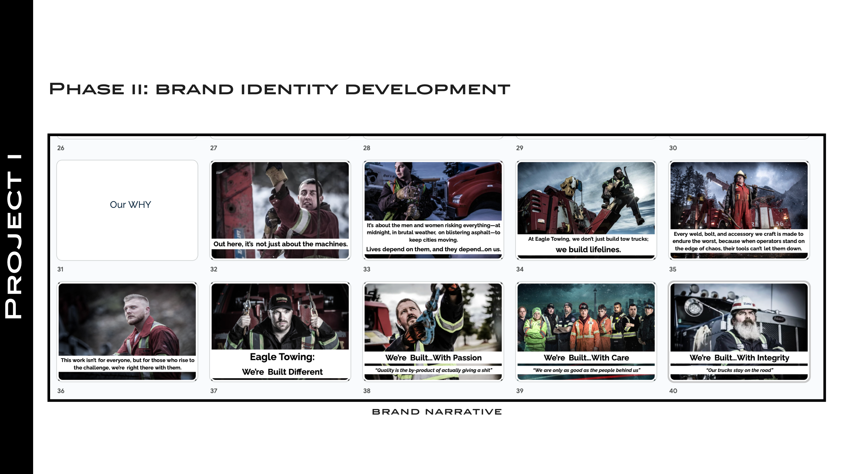
We translated our research insights into a structured brand narrative. The operators became the absolute heroes of the brand, showing how Eagle Towing Equipment stands right alongside them, offering unwavering, heavy-duty support.

We developed the corporate tagline: "Built Different." This is a powerful, double-edged message that references:

  • The superior physical durability and engineering of their tow truck builds.
  • A close-knit company culture committed to supporting their people and partners through thick and thin.
Brand Identity and Narrative
[03 / VISUAL LANGUAGE]

Sleek, Geometric, & Prestigious Identity

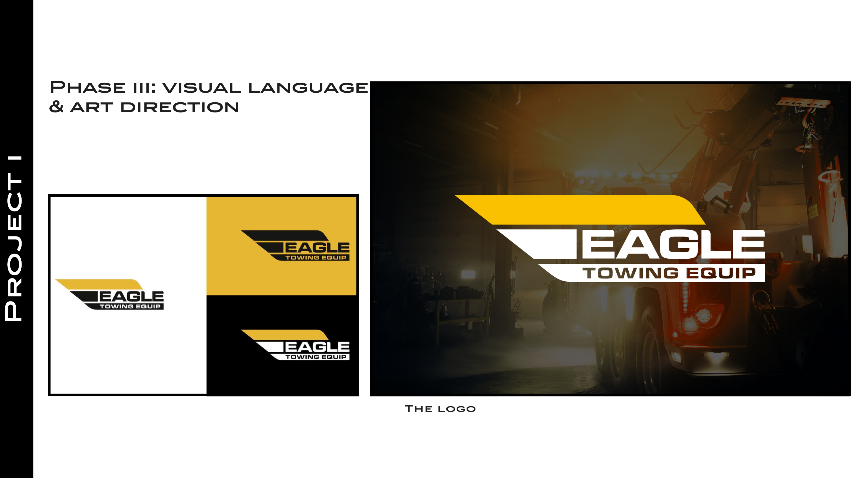
With the narrative crystallized, we designed a striking, technical logo. The emblem was inspired by the eagle profile (symbolism held dear by the company founders), the distinctive shape of their signature tow truck boom, and an interlocking trifecta of the letter "E".

We implemented a prestigious monochrome palette that signals precision and grit, ensuring they stand out in the heavy manufacturing sector.

Geometric Logo Ratios and Grid
[03.5 / APPLICATIONS]

Real-World Execution & Merchandise

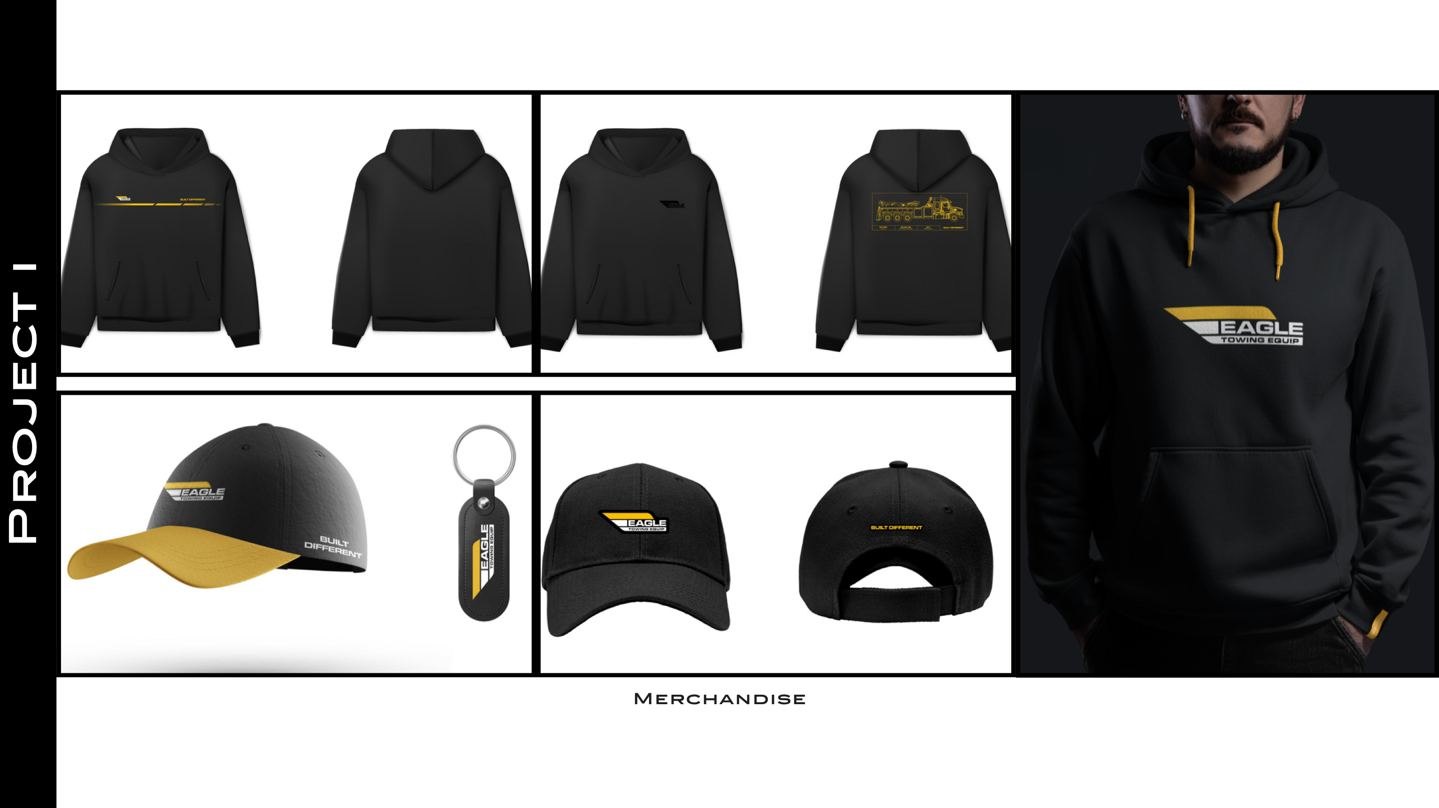
A purpose-led brand must live tangibly across every customer touchpoint. We mapped and designed the new visual identity onto vehicle livery, truck emblems, high-visibility operator safety uniforms, and premium company merchandise.

Every application was detailed in a exhaustive, high-craft brand guidelines book, ensuring consistency across all future second-generation marketing activities.

Merchandise and Safety Apparel Applications
[04 / HANDOFF & ALIGNMENT]

Internal Brand Alignment Training

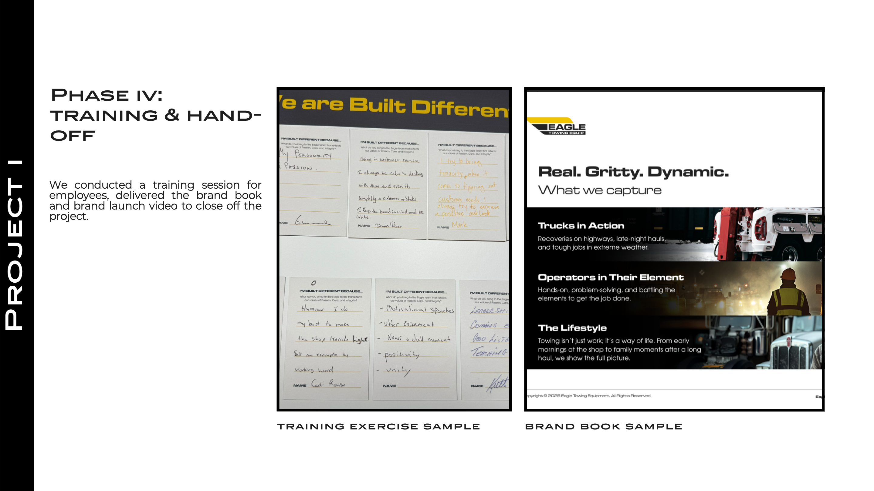
To ensure the brand was lived internally, we conducted an on-site training workshop for all employees, helping them understand and internalize the new values.

To close out the transformation, we delivered the comprehensive brand book and directed/produced a high-quality brand launch video showcasing their heritage and operators.

Employee Training and Brand Handoff